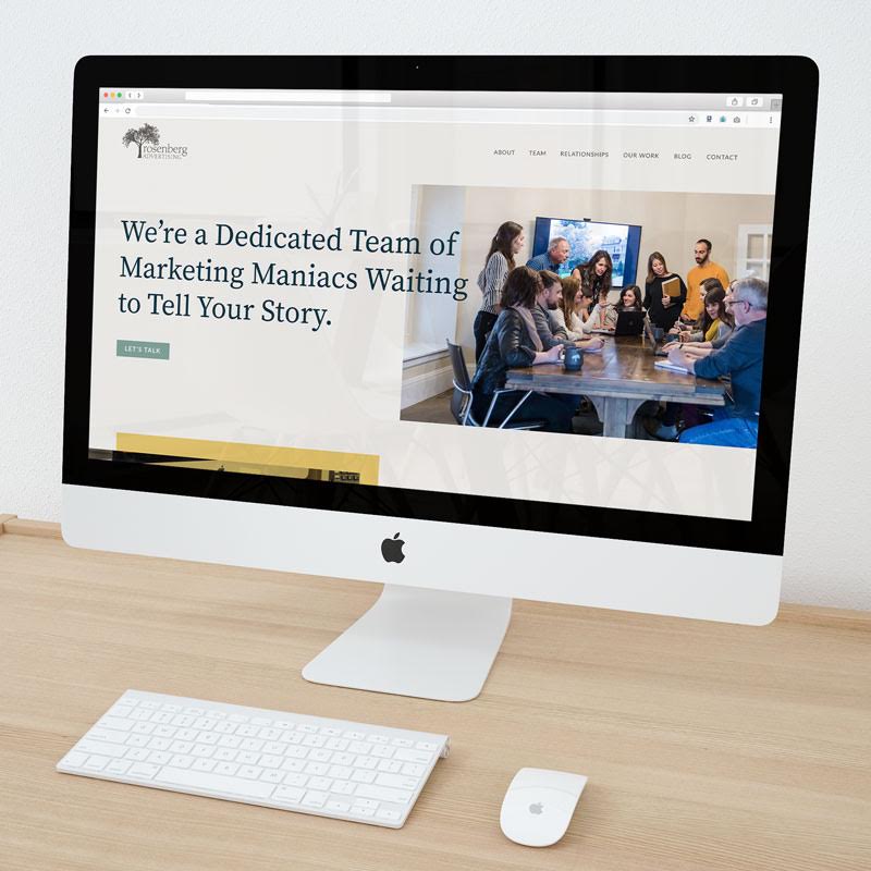
Welcome to the new Rosenberg Advertising website! We’ve spent months planning, designing, developing, writing, tweaking, and tweaking some more until we got it just right. We are so proud of the finished product, and hope you love it as much as we do… or at least, as much as one can love a website.
A lot of intention went into creating this website. Every element was custom designed, every word has a purpose, every color was chosen with care, every button was placed with meaning. Click around, and please let me know what you think! After all, you (our client, prospective client, parent, or random website visitor) are who we designed it for!
Regardless of who you are or how you found us, maybe this has you thinking . . . do I need a new website? There were many factors that led us to the decision to redesign our site. Here are a few of them:
It needed to be faster.
Over half of visitors will leave a website if it takes longer than three seconds to load. Three!
Speed has become one of the most important website features (if not THE most important) in the past few years. You can have awesome content, but no one is going to see it if they have to wait for it to load. They’ll be onto the next website. Search engines will also ding your website if it is slow and they won’t serve it for relevant searches, even if it is the most relevant.
To get technical, our old website scored 62 on Google’s Page Speed Insights. T O O S L O W. We made our code more efficient (ask Angelia!), streamlined our site architecture (thanks, Torie!), optimized image sizes (oh hey, Kathryn!) and simplified the design. Our new site scores 98. Much better. 😊
To be honest, I started to dread going to our own website.
Truth? I just didn’t like it anymore!
If you don’t like your website, why would anyone else? It’s completely acceptable to get a new website simply because you aren’t in love with the one you have. I counted down the days until our launch and I may or may not have visited rosenbergadv.com 20 times since. I could not be more proud of our entire team for their work on this project.
Our old website was 4 years old.
The average lifespan of a website used to be 5 years, but as technology has continued to evolve more and more rapidly, the newest research tells us it is now closer to 3 years. If your website is older than that and hasn’t evolved much since it launched, chances are it’s outdated and no longer aligns with best practices. Not to mention, it may not accurately represent you or your offerings anymore.
A successful website needs to be many things, but most importantly, it must communicate your brand message clearly and provide an optimal user experience. From a more technical perspective, it must be responsive (automatically scale to match the device it’s being viewed on), it must be secure, and it must be technically sound. Because the best practices and technologies in each of these areas change frequently, it’s hard for even the best websites to keep up. Of course, you can make improvements to a website throughout its lifetime, but at a certain point, it’s easier, smarter, and more cost effective to start from scratch.
We were ready for a brand refresh!
With our 40th anniversary nearly upon us, we felt it was time for a slight brand refresh while remaining true to our roots (get it?!). Of course, the Magnolia tree isn’t going anywhere, but we made subtle changes to our logo and completely revamped our color palette. Now our brand represents exactly who we are today.
Maybe you are considering updating your brand, recently had a major shift in your organization, or have simply grown and evolved since your current site launched. Regardless, your website should speak to who you are and be the best representation of your current brand. If it’s not, it’s time for change.
We knew we could make it easier to use . . . for you and us.
This one is two-fold. Your website should be user-friendly. That means both for users and for you.
When someone comes to your website, they should be able to tell exactly what it is that you do within two seconds. That’s not an industry rule, or a sales rule—it’s our rule. Why make people work to figure you out? The navigation should be simple and easy to use, and each page should have a purpose. If it’s hard for the user to find the information they are looking for, they will get frustrated and leave.
We kept that in mind, and only created pages and content that had to be here to support the purpose of our site. When someone lands on our new website for the first time, they will know exactly who we are, what we do, and how to hire us—within seconds.
On the flip side, we also wanted the website to function better for us. Websites need fresh content to thrive (and survive!). When it becomes cumbersome to update a website, you are less likely to update it. As a result, your website and your brand will suffer!
Do you need a new website? Like what you see? Let us help you! Rosenberg Advertising specializes in creating custom websites that focus on your audience’s needs. We’d love to tell you a little more about our process – contact us!
Be sure to subscribe to our email list for regular newsletters and industry updates (Hint: Click the tree!).